
Tepte.com


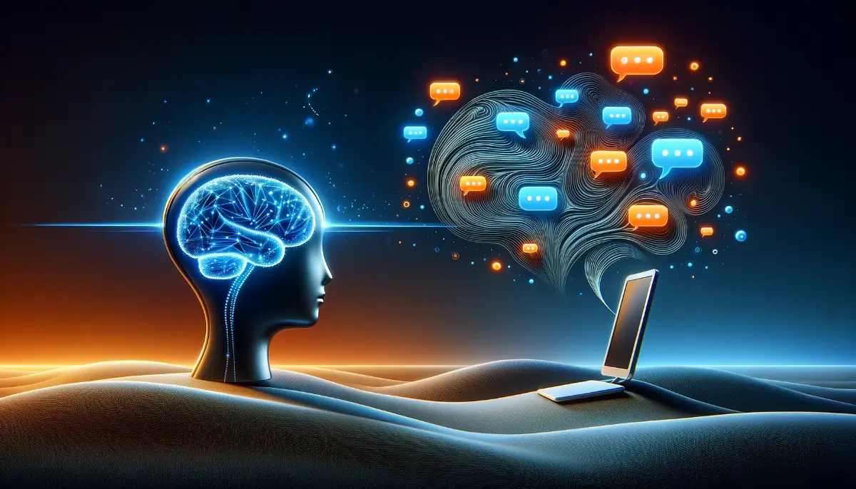
Have you ever wondered why certain apps or websites keep pulling you back, day after day? It's not by accident. Designers craft digital experiences with intention, using subtle tricks rooted in human psychology to encourage return visits. At the heart of this are memory cues and familiarity, which make users feel comfortable and compelled to engage again. In this article, we'll break down how these elements work and why they drive repeat usage.
When you first land on a site or open an app, that initial interaction sets the stage for everything that follows. Smart designers focus on creating a seamless onboarding process that plants memory cues right away. These are visual or interactive hints—like a distinctive color scheme, a memorable logo animation, or a personalized greeting—that stick in your mind.
Think about your favorite streaming service. The moment you log in, familiar thumbnails and recommendations greet you, triggering recognition. This isn't random; it's engineered. Studies in cognitive psychology show that humans rely heavily on pattern recognition. When a digital experience mirrors what you've seen before, your brain releases a small dopamine hit, making you more likely to return.
Familiarity breeds comfort, and in the digital world, it translates to loyalty. Designers achieve this by maintaining consistent layouts, navigation paths, and interaction patterns across sessions. If the search bar is always in the top-right corner, you don't have to think—you just use it.
One key strategy is progressive disclosure, where new features unfold gradually without overwhelming you. This keeps the core interface familiar while introducing fresh content. Social media platforms excel here: your feed looks the same, but the posts refresh, drawing you back for the novelty within the known.
To create addictive digital experiences, teams draw from behavioral science. Here's how memory cues and familiarity play out in practice.
Every element on screen serves as a potential anchor. A unique button style or icon set becomes a shortcut in your memory. Over time, seeing that green "Save" button in the same spot reinforces the habit loop.
Brands like Spotify use album art and playlist covers as memory cues. You remember the vibrant imagery tied to your moods, prompting you to check for new releases.
Push notifications aren't just alerts; they're tailored memory cues. "Hey, your team scored!" from a sports app reignites your last session's excitement. The trick is timing and relevance—too many feel spammy, eroding trust.
Familiarity shines in how these messages mimic the app's voice. If the app speaks casually to you, so do the pings, creating a conversational continuity.

Progress bars, badges, and streaks turn usage into a game. Duolingo's daily goals are a prime example: the familiar owl character nudges you with memory cues like "Don't break your streak!" This builds emotional investment, making return visits feel rewarding.
| App | Primary Memory Cue | How It Drives Familiarity | Return Visit Impact |
|---|---|---|---|
| Infinite scroll with heart icons | Consistent grid layout and story rings | Daily check-ins for new stories | |
| Netflix | Personalized row titles | Thumbnail previews in fixed positions | Weekly binging sessions |
| TikTok | Vertical swipe gesture | Full-screen video transitions | Hourly "just one more" loops |
| Amazon | Wishlist heart and cart icon | Sticky top navigation bar | Frequent price checks |
| Google Maps | Blue location pin | Satellite/terrain toggle persistence | Recurring navigation needs |
This table highlights real-world examples. Notice how each cue is simple yet sticky, fostering familiarity that pulls users back without friction.
"I once led a redesign for an e-commerce app that ignored familiarity. We overhauled the navigation completely, thinking 'fresh' would excite users. Instead, return rates dropped 40% in the first month. People felt lost—no memory cues to guide them. Lesson learned: change too much, and you erase the mental map users rely on." — Sarah Chen, UX Lead at a major retail platform
Algorithms curate feeds based on past behavior, blending the familiar with surprises. This balance keeps you hooked: expected comfort plus delightful discoveries. YouTube's "Up Next" sidebar is genius—it previews content in a familiar format, teasing your return.
One-tap logins, saved preferences, and auto-fill reduce barriers. When resuming feels effortless, return visits skyrocket. Familiarity here means your settings persist, so it's like picking up where you left off.
If you're building or auditing a digital experience, use this ol to embed memory cues and familiarity:
This checklist isn't theoretical—teams at companies like Pinterest swear by similar routines to boost retention by 20-30%.
Here's the nuance: too much familiarity leads to boredom, so designers weave in novelty. Feature flags allow controlled rollouts, keeping the core stable while experimenting. Email digests summarize activity in familiar formats, priming your next visit.
Sensory cues extend to sound and haptics. The satisfying "shunk" of a Tinder swipe or Twitter's chirp notification lodges in your muscle memory, urging returns.
User-generated content adds layers of familiarity. Seeing friends' posts or comments creates social tethers. Platforms like Reddit use familiar upvote arrows and threaded replies, making community dives habitual.
Key metrics include retention rate (percentage of users returning after day 1, 7, 30) and churn analysis. Tools like Mixpanel or Amplitude reveal where memory cues falter. A drop-off at login? Beef up familiarity there.
Heatmaps show interaction hotspots—consistent clicks indicate strong cues. Aim for a familiarity score: survey users on a 1-10 scale for "How intuitive was resuming?"
AI personalization will amplify this. Imagine apps that adapt interfaces based on your habits, heightening familiarity per user. Voice assistants like Alexa use consistent wake words as audio memory cues. AR experiences in apps like Pokémon GO layer familiar maps with new hunts, ensuring returns.
Designing for return visits boils down to respecting how brains work. By prioritizing memory cues and familiarity, you create experiences users crave. Next time you tweak a site or app, ask: Does this feel like coming home? If yes, you've nailed it. Experiment thoughtfully, measure relentlessly, and watch engagement soar.
Users don't return for perfection—they return for the comfortable pull of the known. Master that, and your digital experiences will thrive.
Published: Monday, January 19, 2026 Viewed 2 times.
tepte.com: Your Questions and Answers Resource with a Wealth of General Knowledge
Are you seeking a one-stop destination for comprehensive knowledge and answers to your burning questions? Look no further than tepte.com! Our platform is your go-to source for a wide range of information, all conveniently presented in an easily accessible question and answer format.
At tepte.com, we pride ourselves on being your reliable knowledge hub. Whether you're curious about technology, science, history, or any other subject under the sun, our extensive General Knowledge (GK) knowledge base has you covered. We've made it our mission to provide you with in-depth insights and facts on an array of topics. Read more
